Visualization
We used QGIS for the world map visualization and used the data we collected along with it for doing Exploratory data analysis. QGIS is an open-source cross-platform desktop geographic information system application that supports viewing, editing, printing, and analysis of geospatial data.
You can get more information about this tool from here:
Figure below shows variation in standard Netflix subscription price across the world. Dard Blue colored countries represent high standard Netflix cost whereas, light blue color countries represent low standard Netflix subscription cost.

From the figure we can say that countries in North America and Europe are in general charged more for Netflix subscription than for countries in South America.

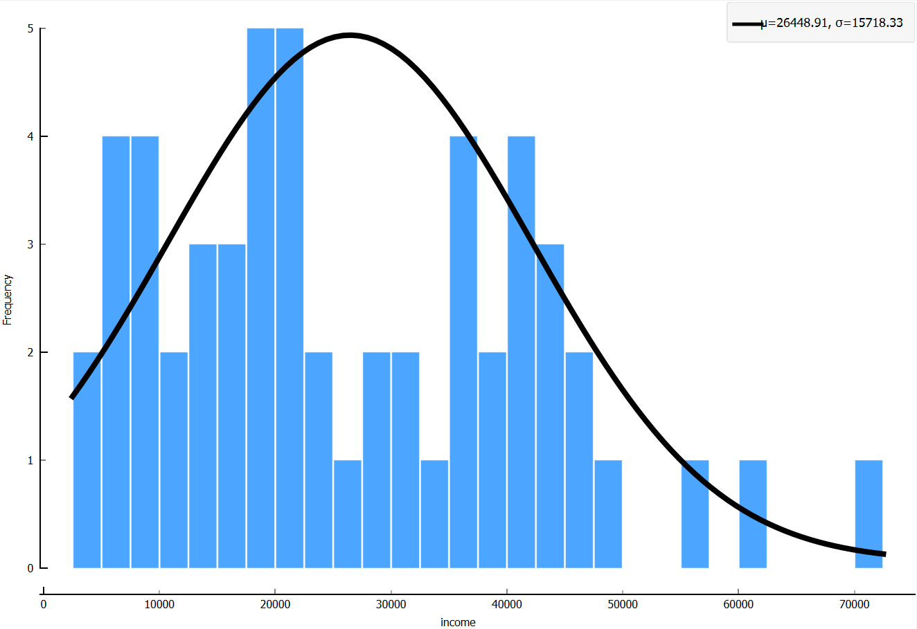
From the figure we can say that, Russia, USA, Brazil and India have higher population.

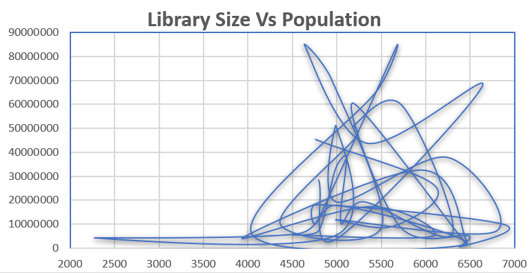
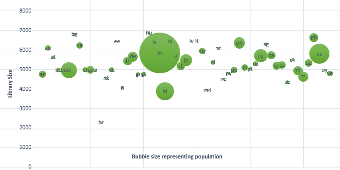
From the above figure, we can observe that even for approximately same population size there is a wide variation in netflix library size.

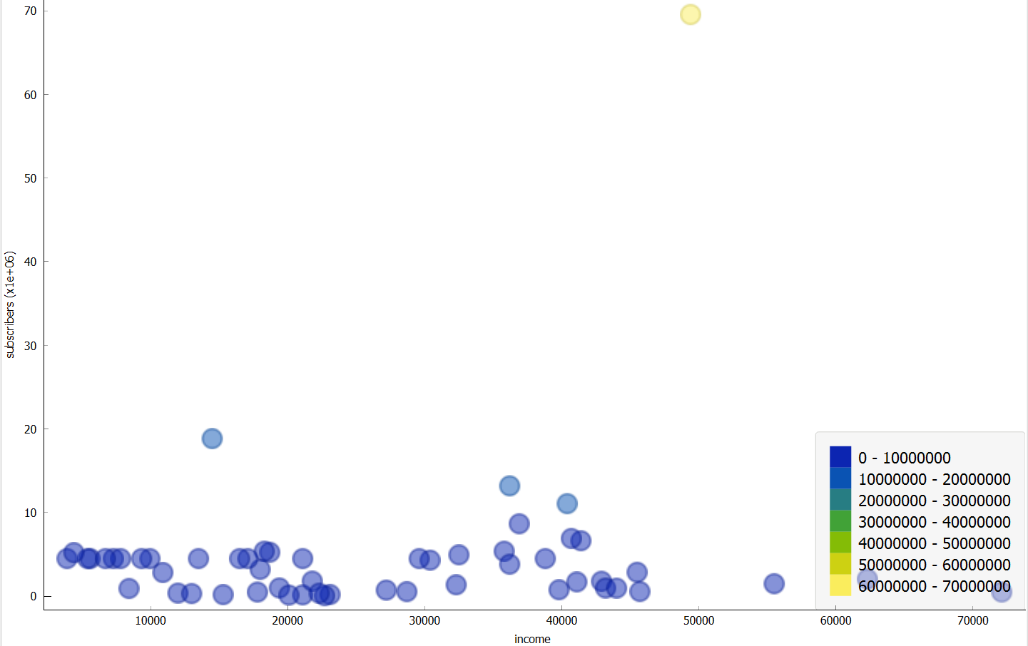
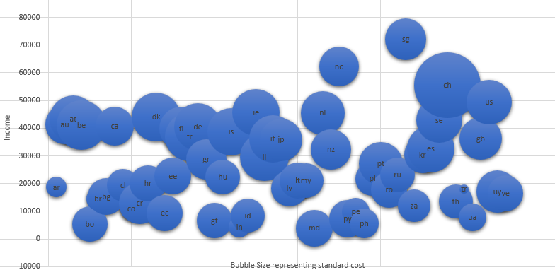
From the above figure, we can observe that there is not much variation in number of subscribers for wide range of income.
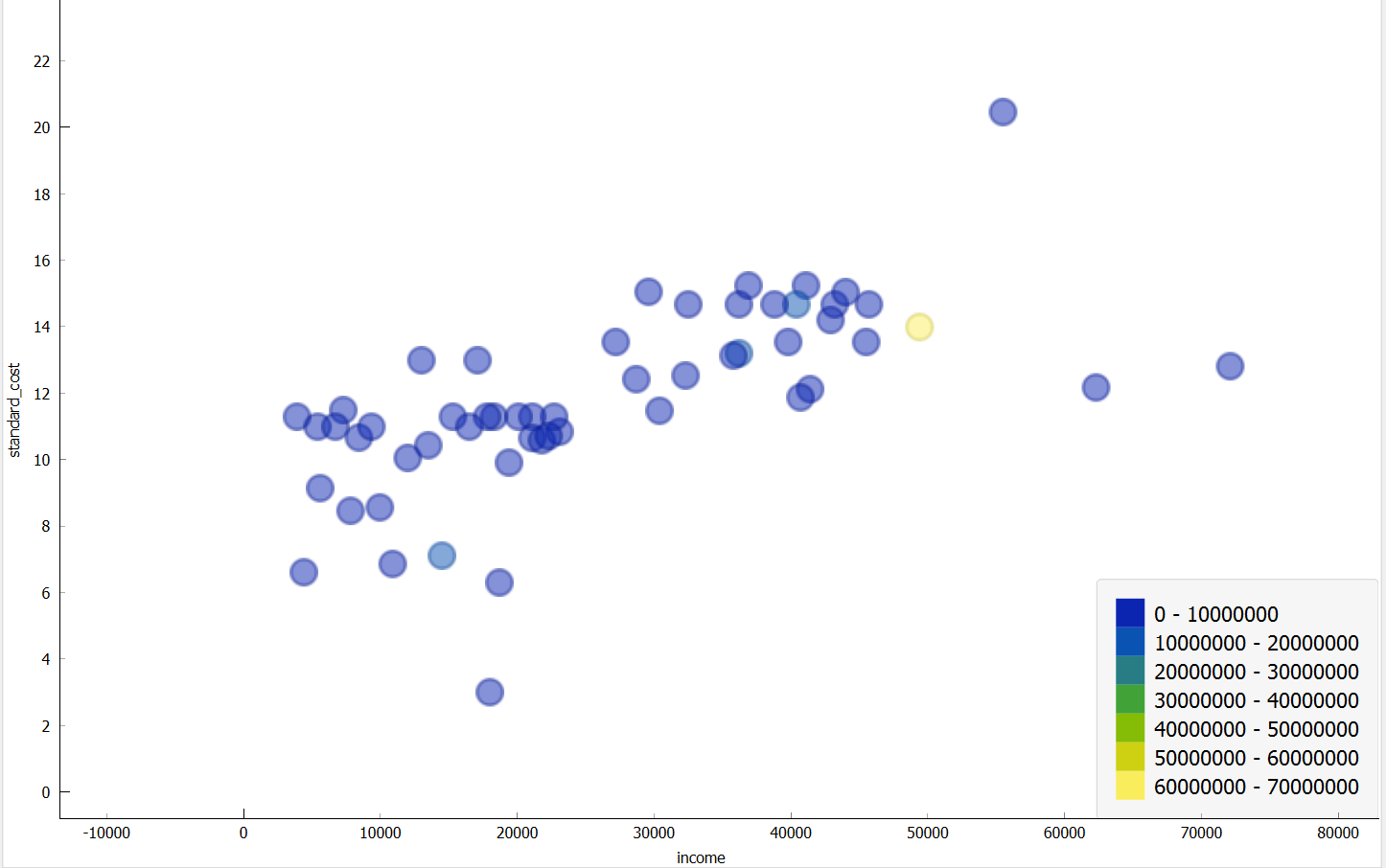
From the above figure, we can observe that as income increases, standard cost for Netflix also increases.